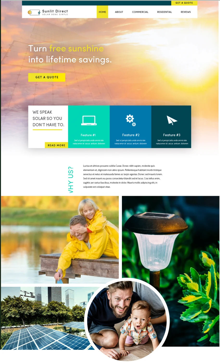
Identity / Guidelines / Web concept
Sunlit Direct
Solar done simple.
One idea, carried through
- The brief
- A clear solar identity extended consistently into brand guidelines and a website concept.
- My contribution
- Logo design, brand guidelines, and website wireframe design.
- The work in use
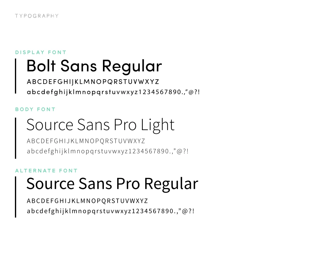
- Vertical and horizontal logo configurations, typography and usage guidance, and a website visual concept. The website is presented as a concept, not a live implementation.
The design decisions
I created the logo, brand guidelines, and website design. A sun, solar panel, and electrical symbol connect with a straightforward name and tagline.
The guidelines explore lightness in color, imagery, and mood. Deep teal balances the brighter colors, while yellow highlights calls to action.
From identity to application.
The website wireframe carries that direction into a bright hero image, prominent quote buttons, and contrasting teal sections. This is a visual concept, shown with its original placeholder content.