Valley Vibes
Serious about play.
A community with energy
- The brief
- An identity that feels serious about volleyball while keeping the color and fun of the community.
- My contribution
- Identity design, apparel graphics, tournament promotion, photography, and photo editing.
- The work in use
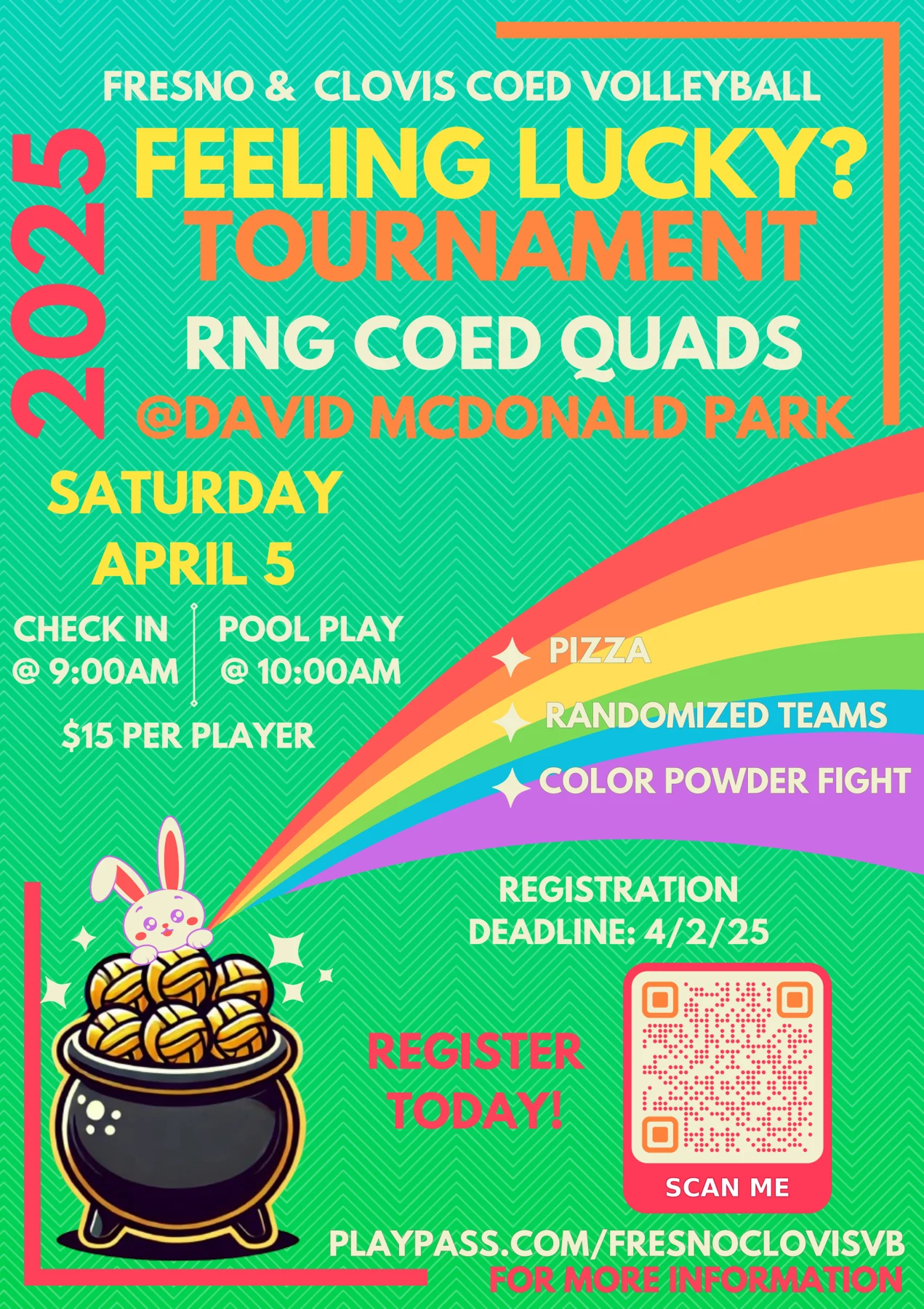
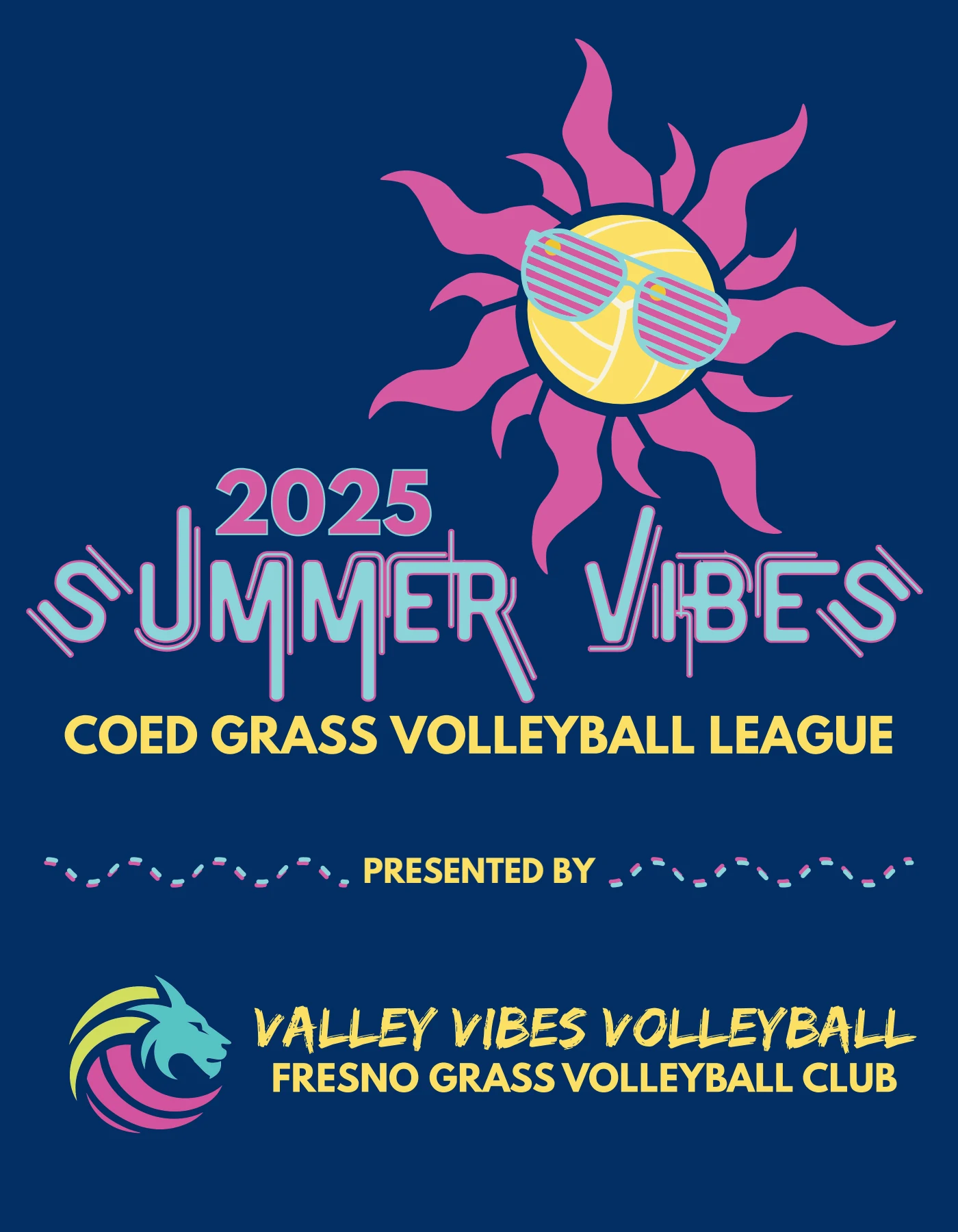
- Summer Vibes artwork was printed on T-shirts given out as league swag. Feeling Lucky is tournament collateral within this same brand.
The design decisions
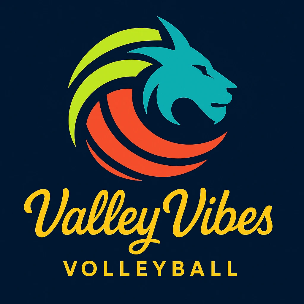
I combined a lion’s head with baseball-inspired curved lines and developed the composition as vector artwork in Illustrator. California-inspired lettering and youthful color give this volleyball community its character.
Gold on navy brought the established feeling I associate with gold leaf on fine cardstock. For the horizontal logo, I wanted a rougher edge and less frilly lettering, balanced by a structured club descriptor.
Made to be worn.
Worth capturing.
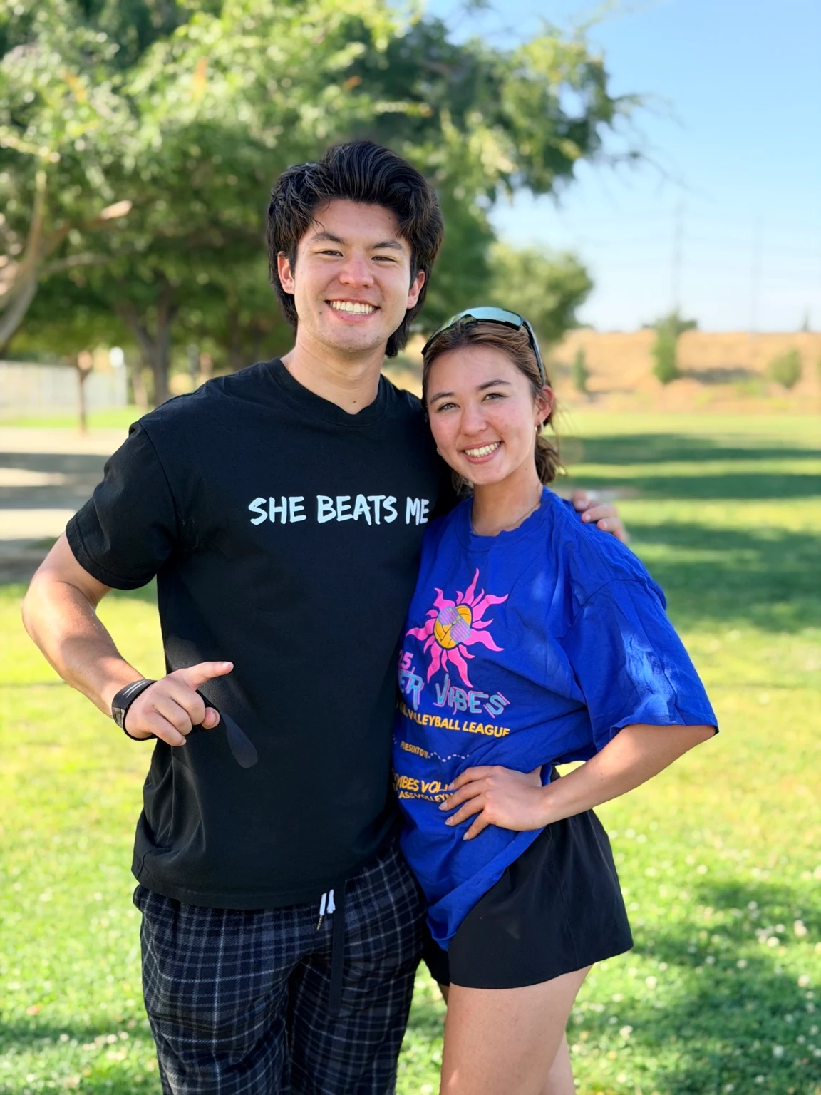
Summer Vibes was used on a T-shirt given out as league swag. I took and edited this photograph myself: another part of my creative practice, photographing the people who bring the work to life.
Feeling Lucky
This tournament promotion belongs to Valley Vibes. I brought spring energy to the flyer through a fresh green gradient, chevron texture, and relaxed typography. Magenta calls out key information, while “Register Today!” and “Scan Me” give the energy a next step.
I directed AI-generated bunny, rainbow, and pot imagery around a playful volleyball theme, then composed the flyer in InDesign and Illustrator.